Tierra Pacifica is a coastal real estate development. We inherited their original logo when we designed their brochure. They wanted to change their logo, but were restricted to the lettering style. They didn't want stray from what they had but they wanted it to look more professional or polished. V
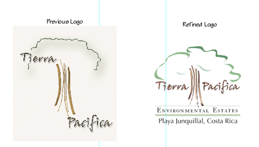
In keeping with the client's wishes we retained the type style. The tree proved to be important to them as well since it represents a large tree at the entrance to the property. The end result was a stronger, better balanced logo.